Call anytime

-
-
Send email
-
150 E Orangethorpe Ave.
Anaheim, CA 92801
Call anytime
Send email
150 E Orangethorpe Ave.
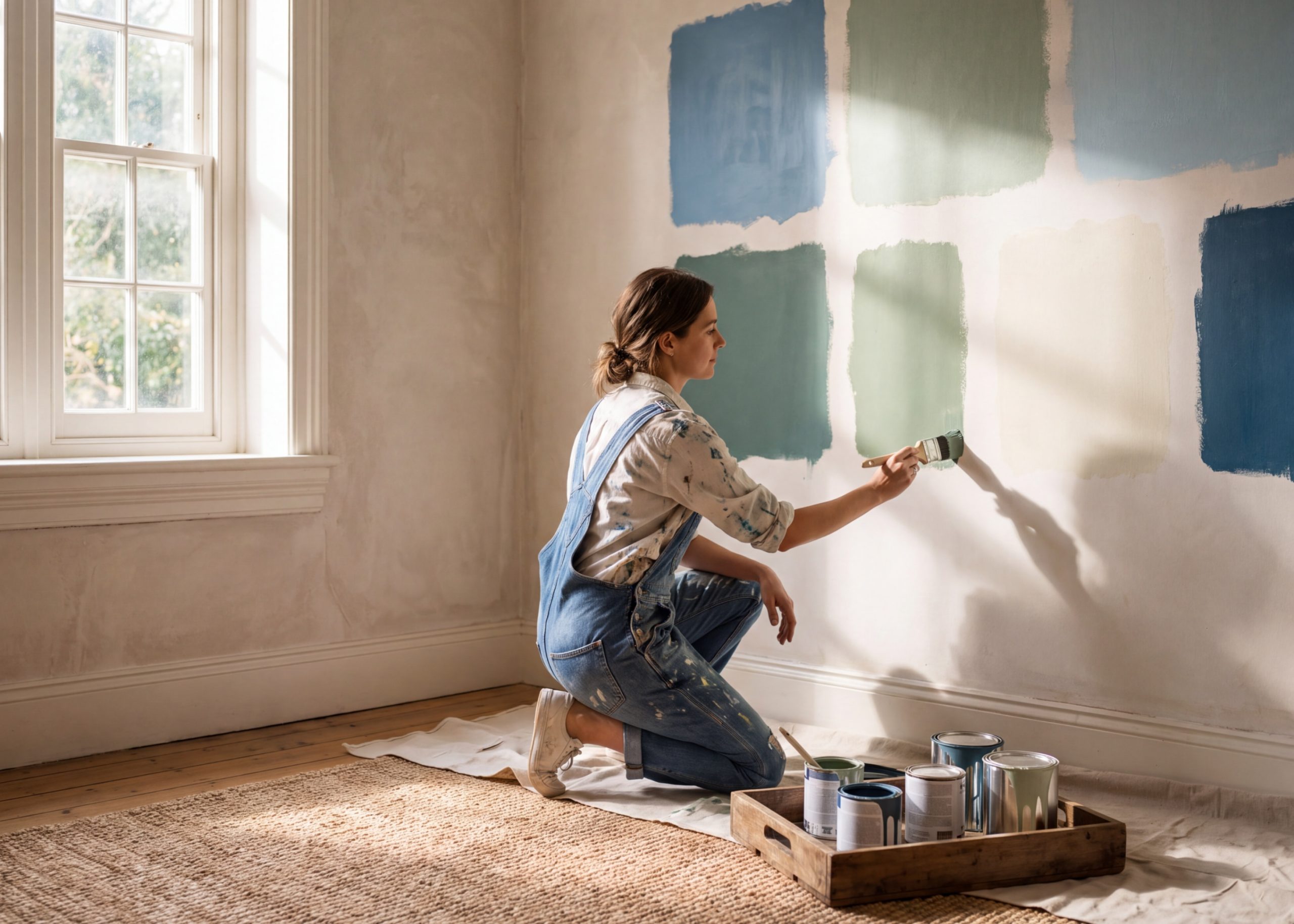
Most homeowners repaint every 7 to 10 years. That means your next color choice will greet you every morning, host every dinner party, and set the mood for every quiet evening at home. Here’s how to choose without regret.
Standing in front of a wall of paint swatches, most people feel confident. Then they get home, hold the chip against the wall, and the certainty evaporates. The color looks nothing like it did in the store. They pick anyway, paint the room, and spend the next several years wishing they hadn’t.
This is not a minor inconvenience. Repainting a room costs time, money, and disruption. Getting the color right before you open the first can is one of the most valuable things you can do for your home. The good news: with the right approach, it’s entirely achievable.
Paint stores use controlled, neutral lighting designed to show colors accurately. Your home does not have controlled lighting. It has morning sun from the east, afternoon glare from the west, warm lamp light at night, and every variation in between. Each lighting condition pulls a different undertone out of the same paint color.
A soft gray that looked cool and clean in the store may read distinctly purple or green once it’s on your walls, especially under incandescent lighting. A warm white can turn yellow in a north-facing room that receives little direct sun. These shifts are predictable once you understand them, but they catch most homeowners off guard.
“A color swatch is a starting point, not a decision. The decision happens on your wall, in your light, at 7am and 10pm.”
Buy sample pots, and never skip this step. Paint generous swatches, at least 12 inches square, directly onto the wall you intend to paint. Observe the color at four separate times: morning, midday, late afternoon, and after dark with your usual lighting on.
Paint the sample on two different walls if the room has multiple exposures. The color on a sun-washed south wall will behave differently from the color on a shadowed north wall in the same room. Both matter because both are what you’ll see when you live in that space.
PRO TIP FROM THE FLOOR
Never evaluate a paint chip held up in mid-air. Lay it flat against the actual wall and step back at least six feet. Our eyes read color very differently at distance and against surrounding surfaces than they do when we’re examining a small card up close.
Every paint color carries an undertone, a secondary hue that influences how it reads in your space. White paints may lean pink, blue, yellow, or green. Greige (gray-beige) can shift warm or cool depending on the undertone and your light source.
To identify an undertone, hold the paint chip against a pure white surface. The secondary color becomes easier to see. Then check whether that undertone works with your existing fixtures, flooring, and furniture. A warm-toned wood floor pairs beautifully with warm-undertone neutrals and fights with cool blue-grays.
Dark colors can look stunning in magazines, but rooms in those images are usually photographed with professional lighting. In a smaller Orange County living room with standard 8-foot ceilings, deep navy or charcoal can feel heavy and confining. If you love a deep hue, consider using it on a single accent wall rather than committing the full room.
Walls that match the sofa create a flat, monotone effect, the opposite of what most homeowners want. Instead, choose a wall color that complements the dominant furniture tone, sitting one or two shades lighter or in an adjacent color family. Contrast creates depth; perfect matching erases it.
Wall color never exists in isolation. The ceiling, baseboards, and door frames are all part of the visual system. A cool-toned wall paired with stark-white trim can feel clinical. The same wall with a warm-white trim reads refined and intentional. These are decisions worth making deliberately.
| FINISH | WHERE IT BELONGS |
| Flat / Matte | Best for ceilings and adult bedrooms. Hides surface imperfections effectively. Not washable. |
| Eggshell | The go-to for living rooms and dining rooms. Subtle sheen, easy to wipe down. |
| Satin | Ideal for hallways, kids’ rooms, and anywhere durability matters. Resists scuffs. |
| Semi-Gloss | Standard for kitchens, bathrooms, and trim. Moisture-resistant and easy to clean. |
This year, homeowners across Southern California are moving away from the all-white interiors that dominated the past decade. Warm clay tones, dusty sage greens, and deep terracottas are gaining ground, colors that bring warmth without darkness and personality without drama.
Nature-inspired palettes in particular suit the Orange County lifestyle well: they complement outdoor spaces, work beautifully in bright natural light, and age gracefully as furniture and accessories change over time.
That said, trends have a shelf life. If you’re choosing a color primarily because it’s fashionable right now, consider whether you’ll still love it in five years. Classic warm neutrals and quiet earth tones tend to remain relevant far longer than any moment’s must-have hue.
Open-plan homes, rooms with unusual proportions, and spaces that connect to other rooms through archways or open doorways present more complex color decisions. Getting it wrong in one room can throw off the visual flow of the entire floor.
At Fullerton Paint, our color specialists work with homeowners through exactly these decisions, not just pointing to a chip on the wall, but understanding your space, your lifestyle, and your goals before making a recommendation. There’s no charge to walk in and talk through a project.
Visit us in Anaheim and bring photos of your space. Our team will help you narrow the options and leave with samples that actually make sense for your home.